How Motion Graphics Work
We define How Motion Graphics Work by turning static design elements into clear, moving visuals that communicate fast. In practice, motion graphics means using text, images, shapes, and animation to support a video’s style and deliver facts in seconds.
In this guide we set expectations. We will cover core concepts, common workflows, tools, and easy beginner paths.
We focus on communication uses — titles, UI cues, explainers — not character-driven filmmaking. That keeps the scope practical for marketing, streaming, apps, and public screens across the United States.
Our pipeline is simple: goal → script → storyboard → design assets → animate → polish → export. We will return to five building blocks: typography, timing, transitions, compositing, and brand choices.
Along the way, we use real examples from film titles, broadcast packages, social posts, and web UI so readers can apply the basics to their own projects.
What Motion Graphics Are and What They’re Not
Motion graphics combine graphic design with controlled movement to make ideas clear in seconds.
We insist on one rule: if a piece doesn’t move, it isn’t motion graphics. The point is concise information delivery, not character-driven storytelling.
Animated graphic design as a practical concept
We use graphic design tools to build layouts, then add motion to guide attention and hierarchy. That makes complex information easy to scan.
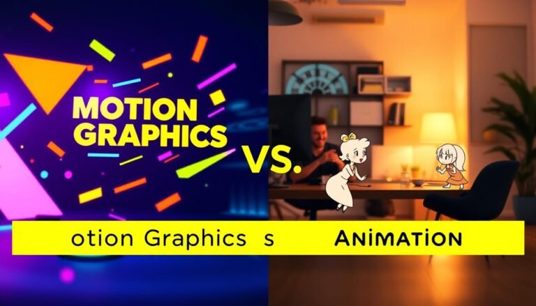
Motion design versus character animation
Motion design often describes the craft and systems we use. Animation usually implies characters, arcs, and narrative beats. Our projects focus on clarity and pacing over plot.
Common elements we animate
Typical elements include shapes, text, icons, textures, and video overlays. Layered compositing—like double exposure—adds tone without rigs.
| Aspect | Motion Graphics | Character Animation |
|---|---|---|
| Primary goal | Communicate information quickly | Tell a narrative or emotional story |
| Typical elements | Shapes, text, textures, overlays | Characters, rigs, acting |
| Common use cases | Titles, explainers, UI cues | Short films, character shorts |
How Motion Graphics Work in Real Projects
In real projects we design movement to make facts arrive faster than a static slide ever could.
The core idea: using movement to convey information fast
We guide the eye with pacing and hierarchy so viewers read less and understand more. This reduces cognitive load and speeds up comprehension.
Building blocks we combine
We pair typography, treated images, tight timing, and clear transitions into one system. Each element plays a role: type sets the hierarchy, images add context, timing sets the rhythm, and transitions link beats.
Color, composition, and brand tone
Color palettes and layout define mood. Clean blue layouts feel technical, bold palettes feel retail, and cinematic frames read dramatic. We match motion style—snappy or smooth—to those choices.
Where effects fit: compositing and masking
Effects are tools for clarity, not decoration. Masking reveals, compositing creates depth, and layering keeps foreground text readable. We add visual effects only when they strengthen the message.
- Example: a 15-second product teaser — 3 beats: hook (0–3s), explain (3–10s), close (10–15s). Timing and transitions carry each beat.
- Every animation is intentional: emphasis, comprehension, or tone.
- These mechanics repeat in titles, UI cues, ads, and broadcast pieces.
| Element | Purpose | Typical Use |
|---|---|---|
| Typography | Hierarchy and legibility | Lower thirds, titles |
| Timing | Rhythm and focus | Explainers, teasers |
| Effects (masking) | Controlled reveals | Product intros, transitions |
Where We See Motion Graphics Every Day
Across screens and spaces we produce, moving design appears in familiar places. It helps viewers read faster and keeps visual systems consistent across platforms.

Title sequences for film and streaming
Title sequences use animated design to set tone in seconds. Classic examples include Saul Bass’s work and Kyle Cooper’s Se7en titles. These pieces show how type, rhythm, and motion define a film’s mood.
TV and broadcast design
Broadcast relies on concise animations. Lower thirds identify speakers. Bumpers reset attention after ads. Sports overlays mark replays and timing, so viewers always know what’s happening.
Explainer videos, marketing, and social content
Explainer videos turn abstract ideas into clear visuals. We use short beats and simple icons to make content fast to scan on social media and web ads.
Web, apps, and public screens
On the web, loading animations and microinteractions reassure users. Retail displays and flight boards update information quickly and readably. This use of motion keeps information current and legible.
| Use Case | Primary Goal | Key Elements | Notable Example |
|---|---|---|---|
| Title sequences | Set tone | Type, pacing, overlays | Saul Bass, Kyle Cooper |
| Broadcast | Clarity on screen | Lower thirds, bumpers, graphics | News and sports packages |
| Explainers & social | Explain fast | Icons, kinetic type, simple animations | Short social ads |
| Web & retail | Guide action | Loaders, UI cues, signage | App interfaces, menus |
The Motion Graphic Design Process We Follow from Idea to Export
Our design path moves a brief from idea to final export with clear, repeatable steps. We use a compact process so teams avoid rework and keep timing predictable.
Define the goal, audience, and message
We start by naming the action we want viewers to take and what they already know. That focus shapes every design choice and keeps text minimal.
Write a script or outline and match beats
We map visuals to voice-over timing so animation supports narration instead of competing with it. This alignment speeds edits later.
Storyboard and lock the shot list
Thumbnails become our motion “shot list.” Each panel notes scene length, key transitions, and on-screen elements before we open After Effects.
Design assets for a clean handoff
Illustrator holds scalable vectors like logos and icons. Photoshop stores textures, mockups, and layered comps for richer visuals.
Animate, refine timing, then export
Animation runs in passes: rough blocking, spacing and rhythm, then polish with easing and micro-movement. At export we set aspect ratio, text safe areas, and compression for each platform.
- Baseline workflow: script → storyboard → design in Photoshop/Illustrator → animate in After Effects → refine → export.
- This way helps designers get started on projects without costly timeline fixes.
| Delivery | Key Settings | Notes |
|---|---|---|
| Social | Square/Vertical, aggressive compression | Short loops, bold text |
| Web | 16:9, H.264 or WebM | Responsive embeds, readable text |
| Broadcast | Frame size, broadcast codec, safe areas | Higher bitrate, color spec compliance |
Principles That Make Motion Feel Professional (Not Random)
We use a small set of principles to turn simple designs into clear, confident motion. These rules shape pacing, hierarchy, and depth so viewers read information faster and without strain.
Easing for natural movement
Easing changes timing so animations feel organic. We pick ease-in for gentle entries and ease-out for decisive stops. Snappy ads use tighter easing; calm UI prefers softer curves.
Offset and delay to create hierarchy
Staggered entrances tell viewers what to read first, second, and third. A small delay between elements reduces clutter and guides attention without extra text.
Parenting and transformation
Parenting links elements so one control drives many. Consistent anchors keep position, scale, and rotation clean during complex animation passes.
Masking, overlay, and obscuration
Masks and overlays reveal content progressively. We use obscuration to build depth while keeping type legible and frames uncluttered.
Parallax, dolly, zoom, and anticipation
Parallax or a subtle dolly adds camera energy to flat layouts. Anticipation cues the viewer before a change so key data lands with clarity.
| Principle | Benefit | Typical Use |
|---|---|---|
| Easing | Natural feel | UI, ads |
| Offset/Delay | Hierarchy | Titles, lists |
| Masking/Overlay | Depth | Reveals, transitions |
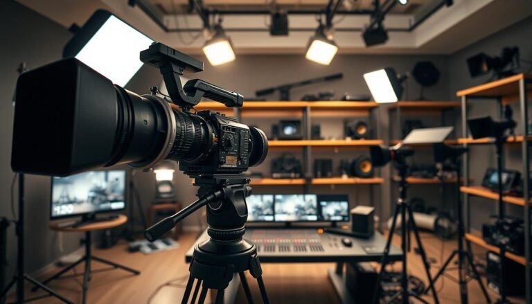
Software and Tools We Use to Create Motion Graphics
We pick a compact toolset that keeps creative choices intact and timelines predictable. The right software speeds collaboration and lets us focus on design, not troubleshooting.

Adobe After Effects as the hub
Adobe Effects is our primary animation software for compositing and keyframe work. We use it to build layouts, animate type, and combine layered assets.
Photoshop vs Illustrator
Use Photoshop for rasters: photos, textures, and bitmap fixes. Use Illustrator for vectors: logos, icons, and infographics that must scale without pixelation.
Edit and finish
We assemble and finalize cuts in Premiere Pro or DaVinci Resolve. These apps handle syncing VO, mixing audio, color grading, and exports for different platforms.
- 3D and VFX: Cinema 4D for approachable 3D, Maya for studio pipelines, Houdini for procedural visual effects.
- Web-based tools offer fast starts for UI or lightweight vector animation when a full desktop app is overkill.
| Tool | Primary Use | When we choose it |
|---|---|---|
| After Effects | Animation/compositing | Main pipeline for motion graphics |
| Photoshop / Illustrator | Raster / Vector assets | Asset prep and handoff |
| Premiere / Resolve | Editing & finishing | Final assembly, audio, color |
Tool choice affects handoff, render times, and plugin needs. Software multiplies our craft, but process and principles deliver the best motion design results.
Designing Assets That Animate Cleanly
Clean source layouts let us animate with confidence and avoid visual noise.
We start by choosing type, layout, and contrast so text stays readable when movement begins. Weight, size, and line length matter. High contrast helps on phones and large screens.
Choosing type, layout, and contrast to keep text readable in motion
Good graphic design begins static. If a layout is confusing before animation, motion only makes it worse. We keep alignment consistent, increase spacing, and leave room for transitions to reduce flicker and fatigue.
Creating scalable vectors for logos, icons, and animated infographics
We build logos, icons, and charts as Illustrator vectors so they scale without pixelation during zoom or parallax. For animated infographics, we separate data groups into layers and pre-plan labels to preserve hierarchy across scenes.
- Name layers, group related elements, and simplify paths before export.
- Use clear type sizes and strong contrast for social formats.
- Keep charts and icons as vectors to avoid artifacting on zooms.
| Asset | Best format | Benefit |
|---|---|---|
| Logo / Icon | Vector (AI / SVG) | Scales cleanly for zoom and parallax |
| Infographic | Layered vectors | Maintain hierarchy and editable data |
| Text blocks | Styled type | Readable across sizes and compressions |
Animating Text, Shapes, and Transitions Step by Step
Good sequences start when type and vector shapes move with clear intent and rhythm. We focus on readable beats and simple paths so every frame communicates.
Kinetic typography that matches voice and pacing
We align word emphasis to voice-over beats. Short phrases enter on strong syllables and pause for breath points.
This keeps text readable and emotional cues aligned with narration.
Shape layers, paths, and trim effects
We animate vector paths and use trim reveals for crisp, scalable results. That preserves quality during zooms and parallax.
Scene transitions and bumpers
Wipes, swipes, and brief bumpers reset attention and keep the sequence fluid. We pick one transition style per scene to avoid clutter.
Timing passes: blocking, polish, easing
Our workflow runs in passes: block the beats, add overlap and spacing, then finalize easing curves. Final tweaks give natural starts and stops.
- Limit simultaneous moves to protect hierarchy.
- Stagger entrances for clear reading order.
- Avoid overusing blur and competing transitions.
| Step | Purpose | Check |
|---|---|---|
| Blocking | Set story timing | Do beats match VO? |
| Polish | Refine spacing | Is hierarchy clear? |
| Easing | Natural motion | Do curves feel organic? |
Applying Motion Graphics to Explainer Videos, Social Media, and Ads
We design tight visual beats that guide attention and shorten the learning curve.
For an explainer, we follow a four-part arc: hook the problem fast, clarify with clear diagrams and callouts, reinforce the benefit, then close with a direct next step. This structure keeps narration and visuals working together so the explainer delivers information quickly.

Social formats that stop the scroll
In the US market, social media favors short loops and silent-first playback. We build thumb-stopping opening frames, use captions, and design tight loops that replay without jarring cuts.
Ads and product overlays
For marketing, we layer motion overlays to highlight features: animated callouts, price tags, and quick transitions that guide the eye through an offer. Pacing and type size change by placement—Stories/Reels need faster cuts than feed or pre-roll.
- Explainer: hook → clarify → reinforce → close.
- Social: silent-first, captions, loop-friendly edits.
- Ads: feature callouts, offer overlays, multiple export ratios.
| Format | Length | Key motion | Delivery notes |
|---|---|---|---|
| Explainer | 30–90s | Diagram reveals, callouts | Clear VO sync, multiple cuts |
| Social Post | 3–15s | Loops, opening hook | Silent-first captions, vertical crops |
| Ad Overlay | 6–30s | Feature highlights, price tags | Safe areas, CTA timing |
Using Templates and Asset Libraries Without Looking Generic
A smart asset library gives teams a reliable launch point for branded content. We treat templates as a time-saver, not a final answer. That keeps deadlines intact while protecting identity.
Where we pull starter packs
We source After Effects templates and packs from MotionArray, PremiumBeat, and MotionElements. For free video backgrounds we use Pixabay. For 3D models and textures we rely on TurboSquid.
How we customize so templates feel original
Our order is consistent: swap typography first, then apply the brand color system, adjust timing and rhythm, and finally refit transitions and effects. This targets the cues viewers notice first.
- Watch for template tells: default easing, mismatched icon styles, and odd spacing.
- Use templates for social series, internal comms, and quick promos.
- Invest in custom design for flagship launches or a brand refresh.
| Source | Asset Type | Best Use |
|---|---|---|
| MotionArray | AE templates, presets | Fast branded edits |
| PremiumBeat | Music & motion assets | Polished social and ads |
| Pixabay | Video backgrounds | Fillers and texture layers |
| TurboSquid | 3D models/textures | Product rotates and depth |
We keep asset hygiene: check licenses, keep editable source files, and use consistent folders. Good organization makes future projects faster and safer.
How Motion Graphics Work When We’re Learning and Building a Portfolio
We learn fastest by building small, finishable projects that show clear craft and judgment.
Start with three beginner-friendly pieces: lower thirds to show hierarchy, title cards for composition, and simple logo animation for timing and brand sensitivity. These projects teach core animation and design decisions without long timelines.
Choose a learning path that fits your budget and schedule. University programs give structured feedback and critique. Self-study with tutorials gives flexibility and faster iteration. We pick based on timeline and goals.
Practice in a tight loop: analyze standout work, recreate it to learn mechanics, then iterate to develop original style. This method builds discipline and decision-making faster than random drills.
Motion design differs from character animation: we prioritize readability, pacing, and systems over acting and performance. Pick one specialty—UI motion, kinetic typography, or infographics—to make a coherent reel and attract the right clients.
- Show range with one consistent visual system across multiple pieces.
- Include export specs and aspect ratios so portfolio pieces feel project-ready.
| Path | Core Benefit | Starter Project |
|---|---|---|
| University | Structured critique | Title card with feedback |
| Self-study | Fast iteration | Logo animation loop |
| Focused practice | Skill depth | Lower thirds series |
Bringing It All Together for Your Next Motion Design Project
This wrap-up turns the article’s concepts into a compact plan for your next project. We summarize a simple framework: start with the message, design hierarchy, animate with intent, and add effects only when they clarify tone or information.
Use a short project-ready checklist: goal and audience set, script beats mapped, storyboard approved, assets prepped, timing passes done, exports tested. Follow these steps for consistent, repeatable results on any video.
Professional motion relies on easing, offset, masking, parallax, and anticipation — not random additions. We choose templates when speed or scope allows, and build custom pieces when brand risk or uniqueness matters.
Validate success by asking: does the viewer get the information faster, is the video on-brand, and does the motion support the story? Apply this process to an explainer, an ad, a UI cue, or a title sequence and improve project to project.